The Advanced Reporting dashboard gives you an interactive graphical snapshot of your sales data across all of your stores by hour, day, week, month, or quarter.
The dashboard shows:
Sales per hour
The interactive Sales per Hour graph shows the gross sales for all of your stores by hour. The graph shows sales data for today, yesterday, and the sales average for the previous 30 days. To show or hide any of these periods, enable or disable the period from the legend.
Note: Mouse over the graph to view detailed information by hour.

Sales widgets
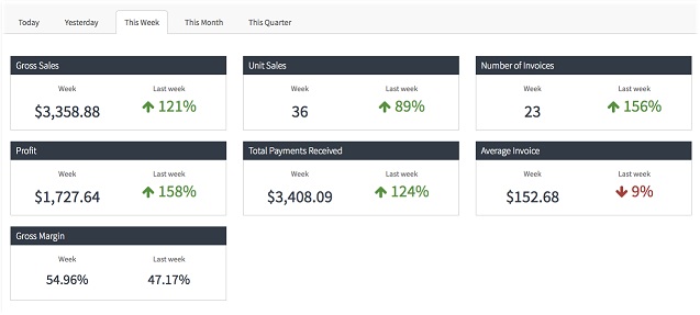
Widgets give you a snapshot of your sales data across all of your stores for a selected period. Use the sales widgets to view:
- gross sales
- unit sales
- number of invoices
- profit
- total payments received
- average invoice
- gross margin
You can choose to view data for Today, Yesterday, This Week, This Month, or This Quarter. Each widget also shows a comparison, as a percentage or dollar value, between the current data and the previous data for the selected period. For example, if you select This Week, the widgets show this week’s sales data and a percentage comparison with the previous week.
